Across living rooms and tiny rentals alike, a fresh rule-breaking approach is taking hold. Designers call it mix-and-match. Homeowners call it relief: the freedom to pair heirlooms with high street buys, velvet with cane, marble with wool, and still achieve calm, cohesive rooms.
Why interiors now break the rules
For years, matching sets and single-wood schemes promised order. They also delivered flat, predictable rooms. The shift of 2025 lands for a reason. People want warmth without clutter, individuality without chaos, and a way to stretch budgets while the season draws in. That’s where mix-and-match earns its place: it balances character with structure.
The rise of mix-and-match in 2025
Mainstream retailers and independent makers have converged on the same idea. Autumn–winter collections spotlight contrast as a design tool: boucle next to blackened metal, cork against gloss lacquer, terracotta with olive green. You see it in catalogues, on your feed, and in newly opened concept spaces from Paris to Manchester. The message is clear: coordinated no longer means identical.
Choose freedom with guardrails: layer personality, but set boundaries on colour, material and shape.
How to blend colours and materials without chaos
Keep to three colours for calm energy
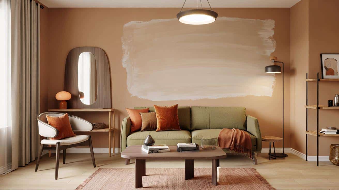
Limit each room to a tight palette. Three colours give rhythm without noise. Use one dominant, one supporting, and one accent to spark interest.
- Walnut and ash anchored by sage green for quiet depth.
- Soft greys carried by off-white, lifted with rust touches.
- Black and honey wood balanced by warm beige in textiles.
Apply a 60–30–10 split: roughly 60% dominant (walls, large sofa), 30% support (rugs, side tables), 10% accent (art, cushions, throws). When in doubt, cool the palette with a natural fibre—linen, jute, raw wool—then reintroduce colour through art or flowers.
Three colours max per room. Three major materials max. Repeat each at least twice for visual echo.
Make different woods talk to each other
Stop chasing identical finishes. Contrast brings life. Pair a warm species (walnut, cherry) with a pale grain (oak, ash) and add a dark punctuation (ebony stain or matte black metal) for definition. Repeat each timber at least twice to avoid the “orphan piece” effect: a walnut picture frame can answer a walnut sideboard across the room.
To blend undertones, add a bridge texture such as a cream wool rug, unbleached linen curtains or a travertine lamp base. These neutrals soften jumps between cool and warm woods and pull the composition into one story.
Bridge vintage and contemporary pieces
Old and new can share the same stage if they share a thread. Pick one connector and let it run through the scheme.
- Connector by shape: repeat either curved profiles (tub chair, rounded mirror) or strict lines (rectilinear shelves, crisp-leg sofa).
- Connector by finish: unify brass lamp feet with a framed print in gold metal and a cane-front cabinet.
- Connector by motif scale: large-scale pattern on one hero item, smaller pattern only once elsewhere.
| Room goal | 60% | 30% | 10% |
|---|---|---|---|
| Warm modern | Beige walls, oak floor | Black metal tables | Rust cushions |
| Cosy eclectic | Sage sofa, wool rug | Walnut cabinet | Mustard throw |
| Graphic calm | Soft grey walls | Ash dining table | Forest artwork |
Echo beats match: repeat a tone, a texture or a silhouette rather than duplicating the same object.
What the most stylish rooms get right
Signals from the high street and the studio
Look at new lines from Maisons du Monde, La Redoute Intérieurs and Zara Home. Their autumn drops pair velvet rust sofas with veined green stone, reissue mid-century silhouettes in calmer proportions, and set them against earthy palettes—burnt orange, olive, natural oak, deep black. Indie makers go further with tactile ceramics, handwoven cushions and reclaimed timbers. The common thread: contrast earns its place, but palettes stay disciplined.
Small homes, rentals and lean budgets
You can test the look without gutting a room. Try this two-weekend plan for under £250.
- Weekend 1: choose your three colours; repaint a feature wall (£35–£50); swap harsh bulbs for warm LEDs (£15–£30).
- Weekend 1 (afternoon): source one pre-loved hero—bentwood chair, vintage mirror, or timber stool (£40–£90).
- Weekend 2: add two textiles in your support colour—cushions and a throw (£30–£60); place a natural fibre rug if budget allows (£60–£120).
- Weekend 2 (final hour): style with three objects in your accent—ceramic vase, framed print, coloured glass (£30–£50).
Renting? Use peel-and-stick film on a table top for temporary contrast. Lean artwork rather than drilling. Swap lamp shades, not fittings. Layer a kilim over a basic rug to badge a “reading zone” without altering the landlord’s carpet.
Lighting, scale and negative space
Layer light like you layer texture. Aim for three sources per room: an overhead for tasks, a mid-height lamp for mood, and a small accent for depth. Mix a metal floor lamp with a ceramic table lamp to bridge materials across the scheme.
Mind scale. A chunky sofa wants a sturdy coffee table; a slim sofa prefers a lighter table on legs. Leave at least 45 cm between seat and table, 75–90 cm for walking routes. Space lets contrast breathe.
Advanced tips that change the result fast
Undertones, sheen and pattern rhythm
Check undertones before you commit. Oak leans yellow; walnut leans red-brown; many greys lean blue or green. Align undertones across large items; let accents carry opposing notes. Mix sheen levels—matte paint, satin metal, gloss glaze—to catch autumn light without glare. Set a pattern rhythm: one large pattern (rug), one small (cushion), the rest plain.
Testing method that avoids regrets
Print A4 paint sheets and move them around for a day. Place fabric samples on the sofa and step back. Photograph the room morning and evening; your phone will show clashes your eye misses. If a new piece still jars, change its distance before its colour—sometimes two metres is the difference between friction and harmony.
If a choice feels loud, reduce its surface area before changing its colour. Scale is quieter than paint.
Useful add-ons for readers who want more control
Risk to watch: visual noise. Signs include four or more strong colours, more than three major materials, and patterns fighting at the same scale. Quick fix: remove the smallest loud item first; if the room still shouts, mute the second-strongest colour with a throw or a table runner.
Advantage to bank: sustainability. Mixing eras rewards repair, vintage hunting and small-batch craft. Try a “two-in, one-out” rule: for every two new items, rotate one to storage or donation. Over six months, that habit keeps the palette tight and the room light on clutter while your style grows richer.